I wanted to show my latest label design. The client wanted a cowgirl/western/retro-ish look, and this is the end product "Crap Shooter." Funny name, but the product smells good. I've also put a detail of the boot I did designed.
Showing posts with label portfolio. Show all posts
Showing posts with label portfolio. Show all posts
Sunday, March 27, 2011
Saturday, August 21, 2010
Do Not Eat!
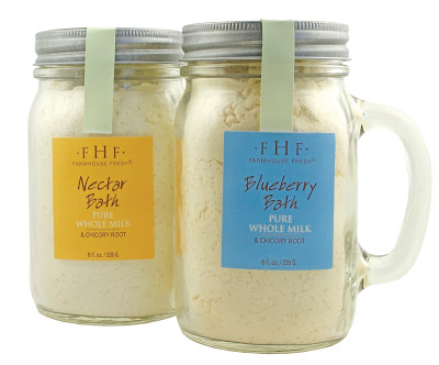
You know those bath & body products and candles that are packaged like little yummy edible treats and smell like a pastry shop? Well, I found another one of those brands called FarmHouseFresh Goods and their bath & body products are delicious looking.
I was asked to shoot some of their products this weekend and here are some of the results. Visit their site and check out the publicity they've gotten.


I was asked to shoot some of their products this weekend and here are some of the results. Visit their site and check out the publicity they've gotten.


Thursday, August 5, 2010
A Great Option for In-Store Signage
I recently did a new logo for a company selling baby shoes... Wee Squeak. Ya, I know... it's cute :-) The shoes DO squeak and I learned that the squeak valve can be taken to stop the squeaking. I contacted this company called Signs of Perfection who turned my logo into a beautiful in-store sign. It's good depth, it's a lot more substantial than foam core and they colour matched my PMS colours.
Take a look...


Take a look...


Friday, July 9, 2010
Doing it Betty Crocker style!
We did a 50s shoot yesterday for program book for the Culinary Celebration in Southlake this year. The organizers wanted an Andy Griffith "Mayberry-ish" theme and we figured Little Bundt Cake would be the idea location. We bought the dresses from ModCloth.com and spent about 2 hours on location styling and shooting. What do you think... convincing enough? What else would you have done?


Saturday, June 26, 2010
Dallas Trade Show Designs
I attended the Dallas Summer Trade Show today and saw the candle packaging designs I had done all boxed and finished... they looked great.
The line is for Bec&Chelle candles and their focus is faith based candles. The packaging had spot varnish on it too so there was a nice matte + gloss feel to it.
The silver box line is the holiday line which looked spectacular. The boxes were full gloss with and ornament balls are available in jewel tones- opal, seagreen, magenta and amethyst.


Friday, June 18, 2010
Bag Design that makes you wanna go Ahhh...
Yes, I am tooting my own horn... isn't that what blogging and tweeting and facebooking is all about anyway? lol
So, here is a bag design I did that I just couldn't resist discussing... The concept of the bag is feminine and luxury, but unique. Originally these started as candle boxes, which are still being developed, but the bag quickly become a great accessory.
The logo design is something simple to complement the large floral. The sides of the bag have purple stripes in various shades and tints of purple.

Monday, June 7, 2010
Essential Pointers in Food Photography...
So, what's the key to great food photography?
Simple... Does it jump out of the page and make your stomach growl?
I did a food shoot for kelloggs recently of various breakfast-like items. It was fantastic. Behind the camera is where I lose myself.
How did I shoot these? here are some pointers-
*I shot all of them indoors (at a window sill) except for the cereal photo, which was shot outdoors.
*I used a canon rebel XTI with a 50mm 1.4 portrait lens
*I had a co-worker help me style each dish... we took about 30-40 mins. for styling each dish
*I shot in full manual mode (ISO 100, shutter speed 1/80 and 1/60, f5.6)


Thursday, February 4, 2010
Sometimes Simplicity is Good
Tuesday, January 19, 2010
A Winner!
My package design won the 2009 American Package Design Awards hosted by GDUSA and Neenah paper. Category: Most Innovative Cereal Packaging/Self Promo
I am quite excited! :-) And the design firm I work for "The Vital Design Group" produced the physical bag in-house. Two flavours were developed for The Good Bag cereal- Morning Light and Evening Hearth.


I am quite excited! :-) And the design firm I work for "The Vital Design Group" produced the physical bag in-house. Two flavours were developed for The Good Bag cereal- Morning Light and Evening Hearth.


Subscribe to:
Posts (Atom)


